If you want to be informed when a new interview is online, follow us on Instagram and LinkedIn
For any question or potential interview requests, write to info@developments.media
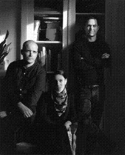

Developments was founded by Simon Descamps, Isabelle Moisy-Cobti and Antoine Soubrier (pictured above, from left to right) who are the managing partners of Bildung.
Developments website has been designed by Bureau Antoine Roux and developed by Tristan Bagot.
Could you please introduce yourself?
My name is Yorgo Tloupas, I’m 46 years old, I’m a designer and I currently live in Paris, France. I came back here a dozen or so years ago. Before that I spent 10 years in London.

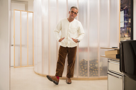
Yorgo Tloupas in his Paris office
Could you tell us a little more, please?
I’m a designer. I prefer the single word “designer” because to me, “graphic designer” sounds somewhat limitative. What I do has a larger scope. My aim is for my work to remain invisible. In my opinion graphic design tends to be a little too “visible”. I strive to present things in the most efficiently arranged way possible. Now is that graphic design? I’m not so sure. I have a small Paris studio with a dozen employees called Yorgo&Co. My career path has been independent all the way: I graduated from the Penninghen design school in 1996 and have never worked for anyone.
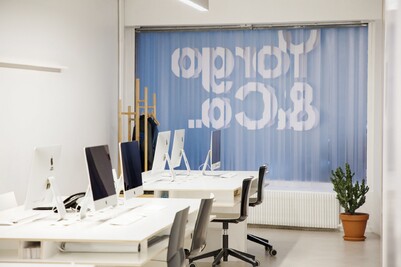
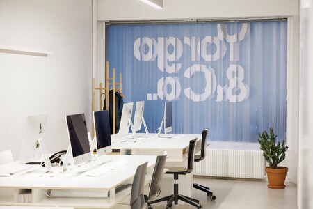
The Yorgo&Co office
Was this a firm choice?
Yes. I didn’t really have a career plan or a strategy, but I was lucky enough fresh out of school to get in the door thanks to my diploma which was a visual identity and a line of snowboards for Rossignol. They were my snowboarding sponsor, and they ended up buying my diploma, which gave me a financial cushion and so I didn’t have to look for work. I could easily hold out a year with what I had earned, especially with my frugal student mindset, and was therefore able to do things I liked independently with people I met. It wasn’t a conscious decision, but working for an ad agency never crossed my mind – nor did the idea of making a CV. I never made one in my whole life. I’m very lucky as far as that goes.
How big does a studio have to be to become an agency?
It’s not necessarily a question of size. My shrink agreed with me; she said it’s a question of terminology. You can have 40 people working in a studio and four people in an agency. The approach makes the difference. It may seem snobbish to say: “We’re a studio, not an agency”. The next even more snobbish step would be to call it an “atelier”.
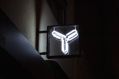
Yorgo&Co’s office sign
There is also “bureau”.
Yes, that’s even more snobbish, as if you were calling a line of clothes “Vêtements”.
Where does the difference lie? In the approach to strategy?
It’s purely subjective. That’s what I always say to the client: we aren’t here to make money but rather to create things that are beneficial to everybody (the general public, the client, us). Unlike agencies, we don’t take financial risks that force us to land enormous moneymaking projects just to be able to pay our employees. I imagine that the fact that we submit very few proposals places us in the studio field, whereas the ad agency business model is based on participating in pitches. On the rare occasions when we do pitch we always tell the client that we don’t like this kind of thing and that the end result will necessarily reflect our reluctance.
What could convince you to participate in a pitch?
The size of the project and existing relationships. If you’ve been working with a certain client for a while and he asks you to pitch, you can’t say no. On the other hand, if someone I don’t know asks me to, there’s an 80% chance I’ll say no, unless it’s a fascinating or really fun project, or something we can do easily, or if there’s public financing. We submitted a proposal for the Olympic Games mascot… which was exciting, except we didn’t get the job. I have no idea who did, but our little flame with eyes would’ve been a very cute plush toy.
What is your current overall opinion of the profession, and independent designers?
There’s loads more people around than when I started out, and I get the impression that Paris is no longer the epicentre of activity. There used to be a very Parisian scene, and Marseille, and Lyon; now there are very good studios and good designers everywhere in France. I can only applaud this democratization; the thing I would like is for their work to be more geared to the general public. If there are a 120,000 studios in France, with extremely gifted, extremely demanding young designers all using the latest typographies but only to make obscure theatre posters, then it’s all for naught. They absolutely must work for restaurants, dentists, local brands. Pop culture needs to embrace graphic culture. Like in English‑speaking countries.
Is this also how you see branding?
Yes, this is what I aim to do on varying levels; I also try to steer my students in that direction. I ask them if someone in their family has a cheese shop or a Thai sandwich shop, whatever. If so, then redesign their logo! Your act will benefit a lot of people.
For free?
Not necessarily. I did a lot of things for free and continue to do so after 25 years, but that’s not what I tell my students. They’re still students, so the fact of producing something that exists will always be beneficial to them. On the other hand, the phrase “You’ll be paid in visibility” even though it’s ironic, a joke, is still kind of true. On every level. In other industries it is almost a business model. Big consulting firms like Mc Kinsey do “Pro Bono” work for governments, then get contracts for millions of Euros on the back of it.
Has this state of things evolved at all?
Back in the days there were studios that were obscure but didn’t need to communicate. This however was before social media. We don’t communicate the same way nowadays. The same way a politician, a hospital or a police station needs to communicate in a contemporary manner, the Roubaix Friends of Dogs for example has a twitter feed to communicate about saving dogs.
You have to play the game. But it’s a double‑edged sword: you delegitimise the business if you work for free.
What were your visual and/or artistic references during your student years?
I was a student in the 1990s, which was a time when the French graphic design scene was imbued with activism, special attention was paid to culture and there was a quasi‑instinctive rejection of commercial work. My approach was radically different. I wasn’t interested in designing things for high culture. So I directly entered the business world. What frustrated me then and continues to frustrate me is the generally poor level of graphic design visible on the streets of our cities and towns. I still wonder why when walking around in a city, an industrial zone or even a supermarket, my retina needs to be savagely assaulted by such shoddy, ill‑made designs. I was convinced then and still am that graphic design and craftsmanship reached a peak in terms of quality and rigour in the 1950s, 1960s and 1970s and that it’s all been downhill ever since. I’m concerned by the idea that art has ceased progressing: you can’t say that Damien Hirst’s work is more evolved, or superior in terms of value, to Michelangelo, or Phidias. Though naturally we’re talking about different media, there hasn’t really been progress. Whereas you can say that a neurologist in 2021 is better equipped than a medieval fortune‑teller. In graphic design you can follow a pattern of progress up until mid-twentieth century, but I can’t name one major evolution since, beyond the actual tools used.
So you’re saying that as far as typography goes, outside of a technical acceleration there’s been no real progress in lettering design?
That’s right. The only aspect in which real progress has occurred is animation: screens and everything that moves on the screens, variable fonts, which is by the way a fabulous evolution, and something Adrian Frutiger didn’t have to hand.
Some might call your point of view highly conservative if not outright reactionary. How with that point of view, do you maintain your motivation and creativity?
Even if excellence has been attained in certain areas, in others progress is still sadly lacking. A box of yoghurts still awaits nice packaging; and in Perpignan there’s a hairdresser pining for a beautiful sign. Yes, that super‑hyped Australian cosmetics firm already has everything, but there’s lots of areas that need us. I see it as a kind of crusade and I encourage my students and employees to lead it with me. On the other hand, our philosophy precludes us redesigning certain logos; Mitsubishi, for example. How could I improve the Mitsubishi logo? Same goes for Habitat: if they came to see me I would refuse their offer and beg them not to mess with their identity.

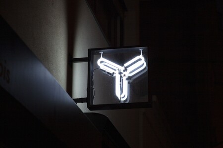
©Black Crows
In other words, the mission you’re on helps you stay creative. It’s a philosophical stance.
It’s a mission that worries me sometimes. When I get old I’m going to look back and wonder if it was worth it, being all quixotic about changing the visual landscape, and failing in the end to do so. After more than 20 years of work, I don’t think I influenced it, but I do see things evolving, ever so slowly. Fifteen years ago I was regularly writing articles in Magazine about catastrophic logo redesigns. It’s been five or six years since I last felt impelled to write, so it would appear that things are improving in terms of logo redesign. It’s a long‑haul battle. That’s the quixotic side: constantly combating windmills. While faced with the complete and utter disinterest of the public and business leaders. I have had occasion to explain to big bosses how to tell the difference between a good and a bad logo. Two years later these same bosses redid their logos with catastrophic results. Not only did they not ask me, but they didn’t listen to a word I said. Instead of feeling insulted, I just wonder if it’s even possible to educate these people.
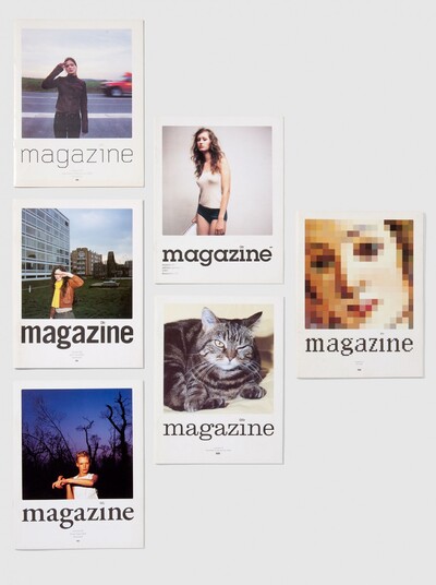
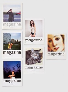
Magazine, Yorgo&Co
Do you feel clients are more educated now than before?
I love what George Lois said: “The more you treat the masses as intelligent adults, the more discerning and demanding they become”. Which is another way of saying pearls before swine. I lived in England, where even an insurance ad is sublime, perfectly calibrated, with risk‑taking in the text, the image, the typography. So the guy who’s launching his building construction company is going to want something at least as good as that insurance ad he saw. Whereas in France our insurance ads are not the greatest. The Cetelem dude isn’t easy to stomach.
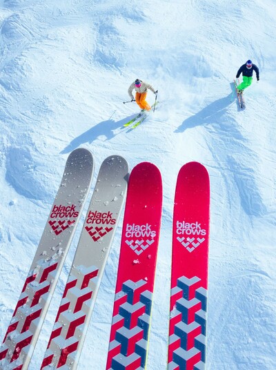
©Black Crows
How do you develop graphic design ideas in‑house? Do you see yourself as the Yorgo&Co creative director?
Yes, I’m the creative director. That’s also why we have a studio: because I still do lots of things. I validate everything that comes out and often go back to the original files. I do all the logos, for example. I may ask someone to improve two or three points but I keep control. This is a luxury I allow myself. I work side by side with my team of course, and they have skills I don’t have, and the end work is a result of that common approach.
So how do you see your creativity and creative energy evolving in the coming five to ten years? And does it remain stoked thanks to your team?
Absolutely. The team is obviously much younger than me and they have a lot of technological know‑how. I sketched our digital greeting card on five PDFs and I asked Clothilde, my intern, to turn the PDFs into a cool animation; and I’m sure she’s going to come up with something surprising. The fact that I’m not stuck with administrative tasks or files gives me the freedom to be creative. I don’t believe I limit the members of my team, even though they all know that I do tend to take on some of the most pleasant tasks myself.
So you like making things all the way through?
Well, they say variety is the spice of life. I design furniture now. I’m thinking of turning our offices into a showroom. I’m also thinking of launching a publishing house; a very small one, without profit in mind, out of a passion for print and if only for the launch party, to see a bunch of people happy to hold a printed book in their hand. I’m on the verge of launching a line of jewellery. And I also want to make candles. And a foundry. And other things, too. I’m also curating an exhibition on the history of logos at the Musée des Arts Décoratifs. There should be a book on the subject beforehand, I’ve been writing it for a few years now and I hope to publish it with Flammarion.


Chair designed by Yorgo Tloupas, photo by Yorgo&Co.
How do you manage to be involved in so many projects?
I have good people on my team. Emmanuelle Beaudet, my business partner is instrumental in making it all happen.
Don’t you ever think about creating a new company with investors and equity fundraising?
I tend to move very slowly with those kinds of undertakings: I like to look and see what’s going on around me. I was talking about this with a friend the other day who told me that Tom Dixon lost control of his furniture company after he brought investors onboard. It’s a classic scheme that tends to happen in fashion, where designers kind of “lose” their names in the process. The idea, for me, is to keep control of my businesses. Which is why I created a holding company. Because I also have my Greek café, Yorgaki„ which was originally a safety net of sorts: if ever my design business went down the tubes I could always work in the greek food industry.

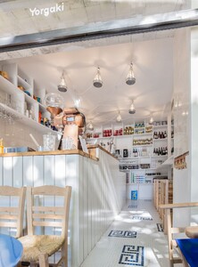
Yorgaki cafe
How does the holding company work? Is it a parent company?
Yes. You can’t have a company that sells olive oil and logos: it’s not the same financial or administrative structure. You have to have two companies and one that presides over them both. My holding company oversees my café, my design company and hopefully soon a bunch of other things, too. The problem is when your name is on things. For the moment, my name only appears on the administrative stuff, not the product itself. I don’t even know if my “furniture brand” will bear my name. The foundry won’t, I don’t think. I’d like a Greek name linked to typography.
This would be a first, since you yourself are already a precursor in terms of personal branding.
I’m not so sure I’m a precursor; it was just happenstance. I have an uncommon first name. If my name were Jean‑Michel it would be another story.
Do you pursue personal branding out of a desire to brand everything?
I grew up with a dad who used his first name – Philolaos – as his artist name, not his last name. So I became conscious very early on of the fact that your first name, if at all unusual, can become a communication tool. But I consider it a shortcut. It’s so much easier when the first name is all that needs to be said; no need for anything else, and it also serves as a shield against the numerous misspellings of my rather difficult last name. But to call me a precursor… I’m not so sure. Though there is a very precise strategy behind it, especially in terms of logos. I believe that logo designer doesn’t really exist anymore as a profession. I defy anyone in France – outside of the profession – to name one logo designer, first and last name. For me, creative power springs first and foremost from a name.
When Bernard Arnault wanted to build his Louis Vuitton Foundation, who did he call? ‘Architecture 2000’ out of Carcassonne? Or Frank Gehry? Why, the latter, of course, the better to be able to say: “My foundation designed by Frank Gehry”. CEOs always call on ‘starchitects’. It’s amazing. Any guy on the street can name a famous architect, though not a single one can name a designer, much less a logo designer!
Though the same is not true for products.
Well, though barely. There’s Starck. Who else? My philosophy is predicated on that. Not on the need to be famous but because when Bernard Arnault goes to ask Frank Gehry to design his foundation he’s not going to tell him he wants it to be green and potato‑shaped. He’s going to say: “Mr. Gehry, how do you envision my headquarters?” I want people to ask us: “How do you see our logo?” However, nowadays, when a big company decides to redesign their logo, talent, creativity, and vision are not considered essential. Mathieu Lehanneur summed it up for me when he said he wanted to be an author rather than a service provider.
Is that why companies approach agencies?
Yes, because they can control them and ask them to copy what they’ve seen in the street. Whereas when you go see the Bouroullec brothers to commission a chair, when you ask Herzog & de Meuron to create a hotel, you can suggest things but you know you’re dealing with people who are very respected and know what they’re doing. The idea is to get to that. I’m far from having reached it yet.
When you consider your numerous current projects, what did you have in mind back in 2010?
The same thing. I could dig up an interview I did in Bulldozer in 2000 in which I was already more or less saying what I’ve been saying today. I already had that obsession with the mass market and how to improve it, and the passion for mid‑century design. In the end, my strategy is to attempt to help people understand design. I don’t do any PR, but I like to be on hand to explain the value of my profession and why it exists. I very quickly realised how difficult it is to get press about graphic design: if you don’t produce something that people can buy and take home – food, furniture, music – it’s very difficult to interest journalists and by extension their readers.
Yet you make magazines.
That’s really out of a passion for the editorial process. I did a cinema baccalaureate and wanted to become a journalist. My family influenced my decision to go to Penninghen, but when I create a magazine it’s really out of a passion for editorial work more than the graphic aspect of it.
Is this approach always present in your work?
Absolutely, it underlies it. In Vanity Fair, there were always a couple of titles I came up with. I would suggest them when we did the first layout test, and sometimes that’s what worked best. It was a pleasure; I adore finding the balance between text and image, a process often undertaken with writers. But I’m often on the front line, one of the first people to read the article in order to understand what I need to commission and design. The journalist does the article, the iconographer works on the visuals, and I choose a title I find suitable, and if it helps with comprehension of the text, it goes to the printers.
Are you doing any other magazines these days?
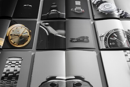
I produce the Cartier magazine once a year; Audemars Piguet, also yearly. We just did an almanac for Vilebrequin which follows the precise codes of these kind of publications. I entirely redesigned the magazine Les Inrockuptibles and it’s coming out in june. I’m working on another magazine which is even more mass market but which I can’t mention, and I’m trying to relaunch Intersection, my car magazine.
As for brand magazines, even if I hate that name, even though their very existence is a contradiction of sorts since the goal of the press is to criticise – which naturally is impossible in a magazine the function of which is to celebrate a brand – I still try to instil the project with a form of journalistic credibility. For Audemars Piguet, I’m the one who proposed the editor-in-chief. I gave them a list of five names, and they chose. Maybe I should set up a bureau grouping together all these people, so that the managing editor would also be in charge of other brand magazines. The photographic direction would also be done by one person; same goes for the graphic design. Across the street from our office we rented a new space for a photo studio, a showroom, and a few desks. What I wonder is if there is a business model for this kind of thing, i.e. getting brands to pay us to make magazines for them and for other brands – their potential competitors – on the same premises and by the same team. And use the resources to publish my own magazine or other magazines. Production and organization are the crux of the matter. I have great graphic designers, great photo directors, etc. We just also need someone who goes through the articles, makes the right calibrations in terms of number of words, ensures that the visuals are all the right definition and in the right files… basically a head of production
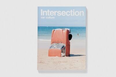
Intersection magazine
All of this seems quite organic but do you have a three‑year strategic plan and a projected chronology of upcoming projects?
All of these things are written down on my to do list. I share a Trello account with Emmanuelle and all the team. All our clients are on there and at the end of that list we have our own projects. And that’s where nobody ever ventures. You see “Jewellery brand” and see how far we’ve not gotten with that. There’s also “Publishing house”, but that’s also moving forward at a snail’s pace. At least it’s written down somewhere so as to make it impossible for us to ever forget our mad ambitions.
But aren’t you afraid of being led astray by new projects that could be detrimental to your initial project mission?
The visual struggle is a long one… Look no further than what a logo is supposed to do: last a long time. Every time I see a logo I wanted to redesign get redesigned by someone else I’m disappointed because I know it’s not going to change again for another 50 years. But in absolute terms, I don’t want to put all my eggs in one basket. I might never get to design an ultra mass‑market logo, Air France for example. For Ricard I did a throwback thing, a symbol, OK, but it itself had a kind of preexistence. I didn’t totally rebrand it; it wasn’t a total change. And I also haven’t been involved in the launch of a major brand, the SFR logo for example when it came out. But I don’t mind doing other things.
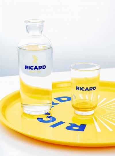
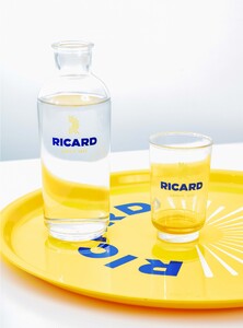
Ricard visual identity by Yorgo&Co

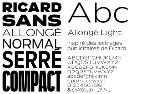
Ricard custom font by Yorgo&Co
If today’s Yorgo could give 30 seconds of advice to the 30‑year‑old Yorgo, what would it be?
Get good lawyers. Image rights are where it’s at. It seems like an incredibly litigious thing to say, but when you have a good lawyer you can sleep soundly and get going on new projects, lock them down with contracts with everything on the up and up. It’s not for nothing that folks want prenuptial arrangements before getting married: it brings solutions to a bunch of potential issues and guarantees that everything runs smoothly even if everything looks idyllic on the honeymoon. Good lawyers are also important in terms of your approach to business which always comes back to the question of getting paid for work in share ownership.
Some guys launch a start‑up, they have no money, you create their logo in exchange for shares in their company. But how do you do that without a lawyer? This situation is more and more common. I have four current projects I’m being paid for with company shares or subsequently after equity fundraising.
A friend of mine who creates furniture was telling me that nowadays designers are focused on royalties. These issues are all super open‑ended. In our business there’s no reason not to adopt forms of equity payment or royalties.
Are people going to finally see the value in creative, independent businesses that don’t depend on anyone else to succeed?
That’s what I’m all about. I’m working on a business plan with my team to decide how to proceed from here.
This of course is very personal, but what’s your take on advice? I mean you have a broad network of people including lawyers who can give you advice.
I have a great thirst for knowledge about the ways other people go about their business. I’m not just interested in knowing what companies my size in France or England are doing; I like to talk with product designers, I like to talk with architects, with the guys who build my skis, etc. And see how business models in other fields can be applied – or not – to our profession.

Are there other strategic elements that seem crucial to your development?
I still use the audit you made for Yorgo&Co a few years ago and which is incredibly interesting. It’s unusual to see that kind of thing in our field.
Thanks, and with PR, do you think it could help you take things to the next level?
Once again, no PR person is going to help you sell something that doesn’t exist. When I launched my café, I thought that I could probably manage it with my network. And it worked. I got Vogue, Les Échos, Le Monde, everybody, all through my own network.
It’s a lot easier to sell a Greek café than a new logo. How in the world am I going to get a journalist to talk about the visual identity I made for Martell? The truth is that people don’t tend to be interested in our profession. I’d love for there to be articles about our work that some top CEO whose business is on the French stock exchange and who needs a new logo would see. That would be the only reason for me to go the PR route. I couldn’t care less if my aunt sees an article about me: I want to attract more attention to the logo designer profession; I’d like the decision‑makers and broader public to know about it. Which is why I taught for a while at Sciences Po, in an attempt to influence those who will wield influence in the future.

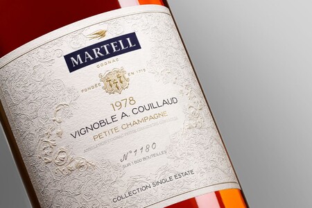
Martell bottle with the redesigned logo, Yorgo&Co
Could you tell me a little about who might have influenced you in terms of strategy?
I like what Jean‑Baptiste Levée did with Production Type: it’s clever, sharp, and ambitious. Strategy in our field, alas, usually all comes down to the network. I often say to my students: “Venture forth into the world!” I wish I didn’t have to tell them to go out for drinks at art openings, but the fact remains: it helps. I can’t think of a single job I’ve had these past 25 years that didn’t more or less happen because I met someone while out and about in Paris. It’s as simple as that. Only in the past few years did we start getting people we didn’t know contacting us. Omega for example: because they saw what we had done for Loro Piana. But the Loro Piana job I got through my network. I didn’t skip a single step in the process, but I found myself in the same room with Antoine Arnault who thanks to some friends we have in common had decided to work with me.
Loro Piana Campaign, Yorgo&Co
Do you still take the time to go out to art openings?
Well nowadays, of course Covid restrictions throw that option out the window. So, sadly, I do rely on social media. I have become a blogueuse. Sometimes I look at my Instagram and think it’s too editorialised. But then how could it not be? I’m displaying my life, which luckily for me is rather pleasant. I edit. When all other avenues of socialising are closed to you, Instagram will do.
We were talking about strategy. Don’t you think you’d be well‑advised to seek foreign investments while maintaining control of the company?
I’ve got an American buddy with unlimited funds, and he suggested we join forces. But I didn’t even know what to say, because I didn’t know how much money I would need. But I’ve approached him about Midnight, my night train project. We need a few hundred million euros. The founders said they were looking for an AD but had next to no money at that stage, so I suggested to get shares in the company instead. I’m a founding associate member.
Did you use your lawyer for that, too?
Yes. Once again, it’s inevitable. In exchange for equity and a minimal fee, I created the logo, the decks, the initial simulations, and I was involved in the choice of designers we’re going to build the trains with. We don’t have the cars yet but we’ve already begun looking for someone to create the uniforms, the smells, the food, the music.
Now there’s a way to change the visual landscape.
Absolutely. It won’t have the size of SNCF but at least we’ll be on the same rails and in the same train stations. What is key in this project and in general is recruitment. I have exceptional people with me, but sometimes it takes me a long time to find them. For the café it was a real struggle to find the perfect manager, and now that we have Nefeli in charge we can finally sleep soundly. And I’m still looking for a development manager. The advice I would give the 30‑year‑old Yorgo might be: “Partner with the right people”. Emmanuelle Beaudet saves my ass every single day. But with other projects such as my magazine Intersection, I have not always had the best partners in certain countries, though the brand has survived thanks to other, abler geniuses. I have no regrets and no way of knowing what this or that project might have become without my associates. And I know I’m not the best partner either: I’m the world’s worst businessman. I’ve got a creative vision but I’m very bad at math, at vision, at money.
Yorgo&Co’s office detail
Strategically, you recommend and teach optimising the way you present your ideas, which you consider essential to making progress.
I tell my students that no matter how good they are there’s always going to be someone less competent and less gifted than them but better equipped at selling themselves.
Otherwise how do you explain the number of eyesores you see everywhere? The French visual landscape is so poor because the marketing people convinced the decision‑makers that the Cetelem bubbly guy logo and SFR’s red square were super brilliant ideas. Since there are people who persuade the CEOs that this type of thing is the way to go, then let’s make sure competent people also manage to sell work of quality.
How do you improve presentation?
It’s like riding a bike around town: if you assume that the driver of the car has seen you then you’re going to be unpleasantly surprised when he cuts you off. Nobody saw you, dude. Riding a bike in a city, you have to be both defensive and aggressive: never take for granted that someone’s seen you. In my profession you can never think for one second that people comprehend what you’re doing. They’re incapable of telling the difference between a good logo and a bad logo, a good font and a bad font. A rule is to only show options you’re proud of, so you’ll be pleased no matter what they choose. Don’t ever show them something so ugly you’re sure it’s going to turn them off, because that’s the one they’ll automatically choose. The other day I was presenting to the CEO of a huge company, a former private banker. The presentation was very didactic. I explained to him that typography is a subtle, quasi‑subliminal code that influences the way people comprehend the message you’re attempting to communicate. For example: “Here are four fonts. A chic one, a punk one, a childlike one and a sporty one”. I showed him four caricatural fonts: a completely childish font, a cheesy artisanal-looking font that looked photocopied, a chic Didot‑like font and then a sporty one Italic, all-cap, very 90s. I showed them thinking it was all abundantly obvious. But he told me he couldn’t differentiate any of them. This man owns many companies, he’s a businessman who’s accomplished every damn thing you can imagine, he’s so connected and yet he was unable to tell the difference between these ostensibly caricatural typefaces. When faced with such a complete misapprehension of our profession you have no choice but to educate the client.
So what did you do?
Well that was extreme. My jaw literally dropped. The following pages contained references to other fonts used in rock and roll, in film; and I was trying to steer them towards a custom typewriter, a slab serif. A John Lennon album cover, a Marvin Gaye album cover, the movie Fahrenheit 451, etc, ‑ all in typewriter. And so he ended up seeing the connection between the font and its effect. It’s pure education. And that’s why in my presentations I often don’t even bring up the first creative point till around page 100, or 150. Before that it’s all about educating, and we take it very far sometimes, all the way back to Antiquity. The fun thing is to educate people about their own brand: sometimes they aren’t even fully acquainted with it. We recently showed a chronology to Audemars Piguet, with all their different graphic eras, and they thanked us afterward. They had never looked at or thought of things like that before.
This is very precious advice, this kind of hyper didactic approach. It’s also the realisation that you have to explain things over and over again.
I haven’t had any complaints yet. Nobody has yet said to me: “I know all this stuff”. Because I don’t treat them like they’re complete morons either. This part of the educative process is really crucial. If you work in mass market. The few times I presented things to more cultured companies, Lafayette Anticipations for example, I needed to explain much less. There’s a much greater referential awareness. There’s obviously a big difference in perception depending on who you talk to, and the more you work in mass market the greater the need to educate.

Lafayette Anticipation, Yorgo&Co
At Pentagram when they present theatre posters the clients walk in the room and the play is plastered all over the walls.
Yeah, but can you do the same thing with logos? For Free, I showed Xavier Niel an alternative to his logo, not because he’d asked me to but because I was able to get a meeting with him; he said: “why not” but didn’t change a thing. My wordmark was of a single piece instead of 4 separate letters. I thought of making hundreds of pins and handing them out in front of the Free offices to make employees think their company had a new visual identity, but I didn’t dare to go for such a guerilla tactic.
You’re used to managing teams. How do you approach management, something you weren’t trained to do?
I learned a lot from my experience in London, where I worked with my Intersection business partner Dan Ross, a brilliant mind who went to Cambridge. He managed a lot of our company’s human resources issues in a very hardcore British manner. He fired people with next to no warning. I learned a lot from him, apart from the firing bit. One of the phrases I often use and that my employees like to tease me about – they even used it as the title of a little book they made about my way of speaking: Never Assume. Dan was the person who told me that. It’s not just a business philosophy, by the way. Never assume things are going to go well. Never presuppose. I don’t know if I’m a good manager, you should talk to them. I’m kind of in my own little bubble, I might be a tad passive‑aggressive, I can be very tough and at the same time I like loosening people up with jokes. I don’t know if that’s the right technique.
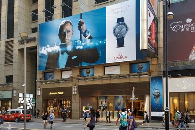

Omega Out of Home campaign in Hong Kong, Yorgo&Co & Daniel Craig
In any case, in terms of turnover…
We have a very low turnover rate, which is a good thing, though in a way I’d rather it were higher. Not that I want to fire anyone, I mean only in terms of my own experience as independent for life: I never envisioned working with someone for so many years and I think they should maybe vary their experiences. I do have a very close, very faithful, very solid team, Sophie Hanoun and Alexis Tse have been here for over seven years. Luckily I have Emmanuelle as a studio director. I doubt I would be able to keep them without her.
What do you look for in an employee?
I now demand a little more know‑how. I’m not looking for “pure” graphic designers but for people who have a skill we don’t have. I want them to be able to do motion design, 3D, editing, photo, film, typography… The more they bring to the table the better.
For example, we’ve never had anyone who could produce and develop web content. On the other hand we do have a key person, Valeria Fiorentini, our archivist. Without her our site wouldn’t even be online. She retrieved work I did going back 20 years; she works it out so that when we have an Omega ad campaign on the streets of Hong Kong the dude from JCDecaux send us the pictures in‑situ. She coordinates so many things; I don’t know how other studios manage their archives without a person in charge.
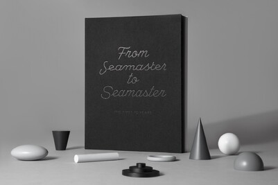
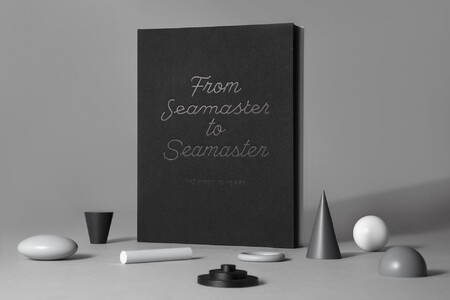
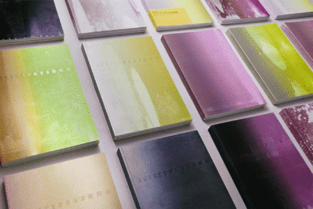
From Seamaster to Seamaster, Yorgo&Co

From Seamaster to Seamaster, Yorgo&Co
It turns out that you think much more strategically than you let on. In terms of recruitment for example.
Well, we have Martin Pasquier, who creates our custom fonts, occasionally aided by the interns, Emmanuelle Lubaki who takes our photos, which means they’re available all the time. Both of them know our company culture inside out and they’re also good graphic designers. Before, we needed to hire external typographers or photographers; we had to rent the material, we had to subcontract. Now it’s way easier.
What’s your current impression of the profession?
The level of quality is very high in France, in Europe, generally speaking all over the world. I see lots of reason to hope, lots of promising talent. You look at Brand New, the website which in my opinion is “the” reference for rebranding: only one project out of 20 sucks. So there’s clearly a positive evolution; it’s organic. I always thought that in France the only way to change the perception of the decision‑makers was through food. If they go to a restaurant and see that the menu, the logo, the plate, the uniform all are better designed than what their company with its 24,000 employees was able to come up with, they might ask themselves a question or two. When I was 20 in Paris, you didn’t have restaurants opening with a nice logo. Nowadays, whether you like their style or not, every venue that opens has its own well‑made design. Either an old‑fashioned throwback French brasserie style, or a super modern style, or sometimes a more daring design. People are bolder. This has been the case for a while around the world, it just took longer to catch on in Paris. There’s a butcher shop where I live, on Avenue Saint‑Ouen, that gave itself a hipster look. They have 5 panel caps, Supreme sweatshirts, the font is all Antique Olive Nord, the thing is called the Billot Club, they print little tutorials called “How to cook a steak”; everything looks great, the wall tiling, their instagram, everything. You wonder what the hell happened! That kind of thing would have been unthinkable 10 years ago.
Are there any trends you like less, for example in typography?
There are design trends, but I don’t pay much attention to them. Graphic design that is loud saddens me more than anything else. As soon as you have something with ‘first semester 2020’ written on it I chuckle. I have ex‑students who do that, so… Victor Rouve, he’s a clever one, I was his thesis adviser at Penninghen. The theme of his thesis was the norm, he imagined a small store where everything was normed, he designed with a font as generic as possible, a blend of the most commonly used ones. Every object in the store was done in the same manner, that is to say that each magazine had the same layout with only the name and the image changed; same for each brand of pasta. It was fantastic, very well thought‑out. After graduation he somehow switched to baroque design, with completely twisted letterings. With technical skills, certainly, no doubt at all. But it’s all ironic. It’s all hyper referential 1990s stuff. And it leaves me cold. I don’t want that type of irony in my work, I don’t want people to get a chuckle out of what they see.
I veered in that direction recently in a skateboarding book for which I created a kind of funny font. It was super graphically laboured in a way, but it had a raison d’être: I called it Module because all of the letters were practically “skatable”.

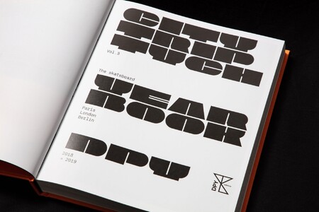
City Triptych book vol.3 Yorgo&Co
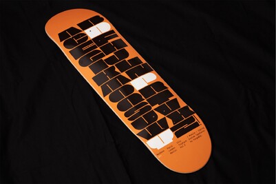

City Triptych custom typefaces Yorgo&Co
Do any emerging studios have approaches that might be similar to yours?
Mirko Borsche? I don’t know. I must say that I don’t pay close attention to what goes on in graphic design, perhaps so as to avoid being influenced and also because there are so many other rewarding things to look at that I don’t really have time to go and look at graphic design.
So what do you do look at on Instagram, then?
I look at some vintage signage and vintage logo design accounts, though I prefer to follow surfing, snowboarding, skiing and skateboarding accounts. It’s much more exciting to see the wave a guy rode this morning in Australia than yet another animated 3D gothic font in pink chrome.
Your model is the rock star model, with a very creative person and his or her entourage.
For a very simple reason: that way the team can say to the client: “Wait, let me go ask Yorgo” or “I’m not sure Yorgo’s going to be onboard with that, let me go ask him”.
In terms of perspectives for Yorgo&Co and overall, what do you see happening?
The risks I might take would be in the production of objects. If no one buys them you’re stuck with them. That’s the main risk, if only because it requires an investment. No, there’s also the risk you take when you recruit a person for development and that person doesn’t develop anything. The caveat is that for 25 years people have been calling me up to give me work. I never did any prospecting, I never sent my work to people I didn’t know. Going to a dinner party and meeting people is a kind of soft power strategy.
You were talking about motion, 3D, typography… Do you have any intuitions you’d care to share regarding big agencies and branding?
I’ve increasingly been wondering about the possibility of automation taking over my profession. I mean, nowadays someone ingenious enough might create an app, a system using the best grid, best font associations, best balance… you press a button and it comes out. What’s to stop someone clever from doing that? Two or three years ago there was an app – I was very sad to see it disappear – called Trend Generator, which generated hipsterish graphic design. It was incredibly funny. You supplied a picture and two or three words and it automatically generated things that looked a whole lot like what you were seeing at the time, 100 % cyan vertical letterings, ironic fonts…
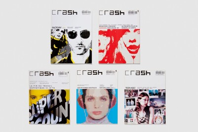

Crash magazine
And mixing and matching? I’m talking about the Cheval vert approach, deciding on an identity with human input and then generating patterns and prints via an algorithm.
It seems a little risky though not uninteresting. We tried to develop a pattern generator for example but it’s like what I was saying earlier: how do we know that very soon somebody isn’t going to come up with an app that can take care of graphic design, even logos? You decide the basic forms you want to work with, you associate the rules of spacing, colour, contrast, etc. And boom! It’ll create logos for you. But what I find rather reassuring is that you soon realise that designing a logo really isn’t that easy. I have a hard time imagining how automation could work. Certain projects necessitate hundreds of tests before I get it right, on paper and on the computer.
Four quick questions.
If you could practice your profession at another time in history?
The 1960s.
A book that helped you gain a better grasp of your profession and your development?
I’d say Primo Levi’s Other People’s Trades. It’s a collection of essays mainly about engineers doing their jobs. One works on an oil platform off of the Norwegian coast, another is building a bridge in Africa. It reads like fiction as he tells the adventures and misadventures of people working, the problems engineers face and how they solve them. It’s fascinating and I think all professions have the potential to generate as much passion as mine. All professions are interesting and mine is a profession like any other, which requires problem‑solving skills. That’s what this book helped me understand. It’s also a way of differentiating what I do from my father’s purely artistic work, which he sometimes did on commission, but for which he often had carte blanche. That’s what I like, when you tell an engineer to build a bridge between this shore and that one, the wind coming from this side, lots of earthquakes in this area, then what material are you going to use? When somebody orders a visual identity for a brand it’s exactly the same thing as making a chair for a school in a flood zone, or a bridge, etc. That book influenced me a lot.
An artist who recently brought about a change in your way of thinking, your methodology or who simply inspired you?
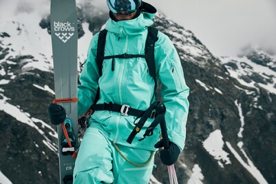
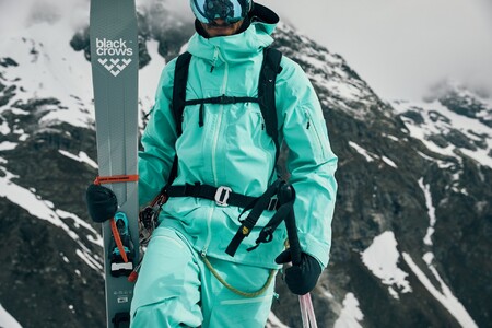
I’d say certain architects, though I haven’t ever seen them at work. I love Herzog & de Meuron, who manage to accomplish something that I don’t like too much in my profession: the graphic gesture. They make unsigned architectural gestures. The architectural gestures of Frank Gehry, you can’t miss them; 800 yards from the building you know it’s a Frank Gehry. With Herzog & de Meuron, it’s a little like building that bridge. They have a problem to solve and they find the best way to solve it, with a creative touch as added bonus. I find deeply exasperating the gratuitousness of the graphic gesture. That’s why I have a hard time with certain contemporary graphic trends. There’ve always been trends, naturally ever since I began working. It started with David Carson, whose experimental visual accidents I rejected from the outset. When I began working with the magazine Crash, fonts that were challenging the norms were all the rage, mixing Didot and Futura in a single alphabet, and it was horrible: graphic design for graphic design’s sake. What I did in 1998 with Crash was exactly the opposite: all in black with no indentation, in Akzidenz‑Grotesk with two different font sizes. It was absolutely rigorous, and I didn’t invent anything, I took the references from the golden age graphic design. I have always been dead set on avoiding trends. After that there was the ‘Ugly Design’ fashion, where you voluntarily crush fonts. You know it’s unacceptable but you do it anyway. Then you have the graphic signature masters M & M, Antoine+Manuel, Åbäke, who all practice a form a graphic design which is louder than what I tend to like, each with a very recognizable visual style. Unlike the graphic gesture, I favour the solution. I want to do something everybody’s happy with and that I can be proud of. The best example is Black Crows, based on the simple and geometric logo I designed in 2006, we built a global ski and apparel brand, entirely constructed on a minimal geometric form, the chevron.