Developments is a slow paced online media offering in depth interviews with strategic minds amongst the independent creative talents, whether they are emerging or world famous. So far, we’ve interviewed the following talents:
Base Design
Sarah Bassett
Isabel + Helen
Colors And The Kids
Pierre Rousseau
Special Offer
OKOK Services
Giga
Porto Rocha
Modem
New Tendency
Mouthwash Studio
Studio Blanco
Benjamin Grillon
Rozana Montiel
Joris Poggioli
Formafantasma
Eike König
Ines Alpha
International Magic
Zak Kyes
Teruhiro Yanagihara
Ezequiel Pini
Clementine Berry
Jonghwan Baek
Dinamo
Ada Sokół
Marc Armand
Elizaveta Porodina
Random Studio
OK-RM
Tomorrow Bureau
Services Généraux
John Pawson
Golgotha
Brian Roettinger
Yorgo Tloupas
Mirko Borsche
Liza Enebeis
Scheltens & Abbenes
Jean-Baptiste Levée
Willo Perron
Stephanie D’heygere
and the following topics have been discussed:
References Development Strategy Advice Management Creativity Prospective Clients Communication Process Prospection Work culture Presentation Competition Design Advertising Typography Ai Agents Finance Architecture Investment Education Cgi Trend Fashion Recruitment Graphic design Nft Music Marketing Branding Research Photography Sound design Blockchain Sustainability Crypto Technology Metaverse
If you want to be informed when a new interview is online, follow us on Instagram and LinkedIn
For any question or potential interview requests, write to info@developments.media
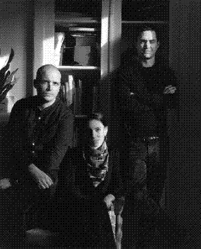

Developments was founded by Simon Descamps, Isabelle Moisy-Cobti and Antoine Soubrier (pictured above, from left to right) who are the managing partners of Bildung.
Developments website has been designed by Bureau Antoine Roux and developed by Tristan Bagot.
© 2026 Developments
References Development Strategy Advice Management Creativity Prospective Clients Communication Process Prospection Work culture Presentation Competition Design Advertising Typography Ai Agents Finance Architecture Investment Education Cgi Trend Fashion Recruitment Graphic design Nft Music Marketing Branding Research Photography Sound design Blockchain Sustainability Crypto Technology Metaverse
16 excerpts on the topic “Typography”
[…] We talked about Peter Saville : he is truly someone who fascinates me. The way he reasons to find solutions to creative challenges … I’ve probably listened to all of his interviews available on YouTube. I’m also really a fan of those multi-polar careers in music. So we talked about Ryūichi Sakamoto and Brian Eno, these are people who brought solutions in sound and music for campaigns and products (Sakamoto created sound design extensively for Nokia, Eno collaborated regularly with Microsoft). But I’m also very influenced by people who helped me see what I wanted to do much more clearly. We spoke of Études, particularly Aurélien Arbet, with whom I host a show called Wave Form on NTS, as well as Marine Serre, but I must also mention Thomas Subreville from Ill Studio, as well as Arthur Van Peteghem, who has a company called Avoir. Bas Van Der Poel from MODEM. And many other creatives from my generation, honestly, I couldn’t list them all now, but: my friends Helena Kadji and Rocio who have a studio called Faye & Gina, who have designed my graphic identity from the beginning, Tristan Bagot who made my website, Marcelo Gomes and Charles Nègre, who have shot some of my press portraits. I am also in awe of the accomplishments of Felix Ward and Pierre Dagba from Matière Noire, as well as Cyrus Goberville at Bourse de Commerce, Pinault Collection. I’ve never worked with graphic designers Axel Pelletanche and Antoine Roux but I think their work is exceptional. I also love the CGI work of Amine Ghorab and Scott Renau from Area Of Work, as well as my friend Valentin Gillet. I love people who make themselves available with their talent to find solutions for others. All the people I haven’t mentioned will certainly feel left out because there are plenty of others, but it’s what whom I can think of off the top of my head […]
[…] JB
When we started out, we mostly adopted the licensing models that we found in use around us. But soon we noticed it’s just weird conventions that nobody can really explain. We knew it meant “back to the drawing board” which was exciting, because there was room to improve. […]
When we started out, we mostly adopted the licensing models that we found in use around us. But soon we noticed it’s just weird conventions that nobody can really explain. We knew it meant “back to the drawing board” which was exciting, because there was room to improve. […]
[…] FH
It really has become a value-based licensing now: small companies pay small fees, medium companies pay medium fees, and large companies pay large fees. It sounds banal, but it was a lot of discussion to get here. About how people select licences, or how people select fonts. And what question should be asked from our side. And when and how. We even tried to use our collected data to play through predictions. Our new system seemed fair to everybody we sat down with. But if people on the internet wouldn’t understand and accept the change, it could have meant a huge loss. […]
It really has become a value-based licensing now: small companies pay small fees, medium companies pay medium fees, and large companies pay large fees. It sounds banal, but it was a lot of discussion to get here. About how people select licences, or how people select fonts. And what question should be asked from our side. And when and how. We even tried to use our collected data to play through predictions. Our new system seemed fair to everybody we sat down with. But if people on the internet wouldn’t understand and accept the change, it could have meant a huge loss. […]
[…] JB
Before, we wrote all things ourselves for Dinamo, in plain and beautiful Art School English. The personal bits and anecdotes around any creation always felt more interesting to us. There are other foundries constantly nodding to history and making that part of their own identity. We respectfully tend to take history as a point of departure, a source we admire. But our communication is less “how it started”, but more “how it’s going”, and who was involved? We might publish a font and you could say “I feel some royal vibes, let’s make up a story with an old king. Maybe he’s a bit mad and sips Coca Cola. We can make this tangible, a fantasy mystery.” And it works. […]
Before, we wrote all things ourselves for Dinamo, in plain and beautiful Art School English. The personal bits and anecdotes around any creation always felt more interesting to us. There are other foundries constantly nodding to history and making that part of their own identity. We respectfully tend to take history as a point of departure, a source we admire. But our communication is less “how it started”, but more “how it’s going”, and who was involved? We might publish a font and you could say “I feel some royal vibes, let’s make up a story with an old king. Maybe he’s a bit mad and sips Coca Cola. We can make this tangible, a fantasy mystery.” And it works. […]
[…] Nowadays, typography is about democratisation and globalization. Which is good, if it means that more people will now be doing typography. It tends to be such an obscure discipline that it’s nice for once to see a light shining on it. But it may be that a typography fad is right around the corner and might, following the reign of the Swiss, herald a return to the Emigre spirit, with experimental type fonts and destruction of the grid. […]
[…] font is always the starting mode of how I think about a project. What’s the typographic visual language? How is typography going to make people feel? Type can have so much emotion and so little emotion.
Where do you find that balance when type can communicate an idea? Every project has that
and I love the fact that type can be a powerful component in a project. […]
Where do you find that balance when type can communicate an idea? Every project has that
and I love the fact that type can be a powerful component in a project. […]
[…] you’re creating ingredients for designers to make meaning. […]
[…] In typography, I really like it because I feel there is much more room for experimentation. […]
[…] The economic model for typography is rather different from graphic design because we are part of those rare designers, much like product designers, whose work can be reused. […]
[…] France has traditionally excelled in the typographical field, except in the sixties and seventies, which we completely and utterly fucked up. French foundries took a beating then. And it wasn’t until the nineties — when our profession began turning away from the industrial to embrace the digital — that French designers again began to make a name for themselves. […]
[…] Typography is a multitude of little chores that can be exhausting. […]
[…] Every year for the past 15 years a good three dozen type designers have appeared on the scene fresh out of a training course in “type design.” Whereas before they had studied “graphic design and typography.” So you do see more typography in portfolios, on websites, in pitches. You see more typographical work overall, mostly in the media. I think this is a cyclical phenomenon. In fact the current wave might already be behind us. (…) Typography is alive and kicking thanks to the increasing number of type design students. […]
[…] What the young type designers are doing today isn’t just a trend. They are much freer in their approach to the business than we ever were. […]
[…] In type design you have lots of people who overestimate their graphic design skills. […]
[…] I get the impression that something new is brewing.
It was easy to start an e-business and produce typography rather quickly. The reason why I think we have reached the end of a cycle is because I have yet to see anything new on the horizon. Something is going to happen; it just hasn’t happened yet. […]
It was easy to start an e-business and produce typography rather quickly. The reason why I think we have reached the end of a cycle is because I have yet to see anything new on the horizon. Something is going to happen; it just hasn’t happened yet. […]
[…] I’m not nostalgic about a golden age of typography. When I think of how typefaces were designed in the past — and I’m not talking about the result, which is magnificent and admirable — it was nothing but suffering. […]