Could you introduce yourself?
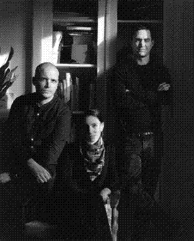
Jean‑Baptiste Levée, digital type designer. I create alphabets, design typefaces, and market them.
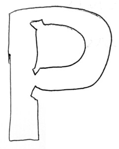
You launched a foundry – Production Type (PT) – a little over six years ago. How would you describe it?
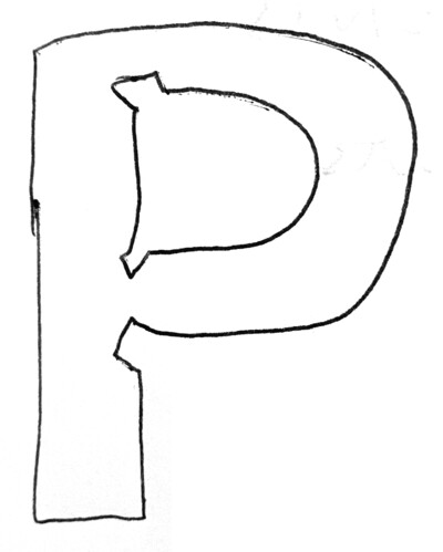
Production Type is a French company with five employees whose activities all gravitate around typography. Our company licenses creative and cutting‑edge retail type designs. We distribute versatile and sophisticated typefaces to a variety of professionals.
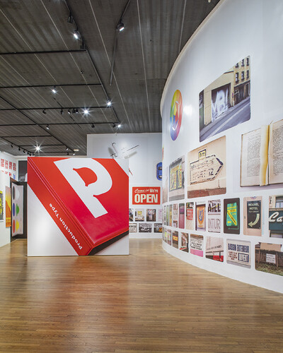

Signals exhibition, MCA Amiens, 2020
How would you describe your current state of mind?
I’m circumspect. Though also full of enthusiasm, energy, and hope for 2021 as regards design in general, French society in particular, and the foundry, of course. At the moment, we’re working on very high‑level projects – with new fonts coming out – and also low‑level, more structurally oriented projects regarding how our products are organized. Generally speaking I’m circumspect given current societal tensions, increasing environmental concerns, and the spectre of social unrest. Professionally speaking I would say “circumspect” regarding various players in the design world and relationships that could be much more satisfyingly fluid. There’s a need and a desire to change things, yet we are but a grain of sand in the immensity of everything.
Who are your creative influences?
In professional terms, there are several historical influences, including for example Ladislas Mandel. He was one of the first type designers to work independently after a long career in industrial type design. He was of the same generation as Adrian Frutiger, another type designer who turned his back on the use of his work by an industry rooted in metallurgy (foundry in the strictest sense is a factory for casting metal) in order to concentrate on creativity. He and Mandel both believed in not being beholden to a reductive, industrial vision of their work.
Strictly design‑wise, there are many influences throughout the history of typography. None of my influences is obscure. I realised early on that focusing exclusively on your own profession dries you up creatively. Many of the best influences are to be found elsewhere, in pop culture for example. I’m at peace with my love of robot movies and have learned to reconcile my bibliomania with my passion for Alien. As for art, I’m mainly interested in American 1960s conceptual art, Donald Judd for example, and light artist James Turrell, the master of us all. I like to cite Turrell as “by far the best type designer out there”.
Obscure influences aside, could you name some typographers you admire?
Pierre‑Simon Fournier. And some contemporaries, who are influences, friends, and models: Christian Schwartz, and Kris Sowersby.
What got you into this profession?
The jokey answer is that my father was a mailman and my mother taught French, so it was inevitable that I should work with letters. The more I think about it, the more I believe that psychologically speaking this is not a joke at all.
My second answer is that I became a type designer out of pure laziness, because it was the easy way out. I was an acceptable photographer, a mediocre illustrator, a pretty bad colourist. In design school I quickly realised that typography – the manipulation of prefabricated letters – was what I did well and easily. Then came the gratification of seeing a visual, an image, a poster, and being able to say to yourself: “Everything I’m looking at right now, the letters, the image, was made by me.” Loads of gratification for very little effort. Which turns out to be contradictory since while it might not be so tough at the beginning, type design is a profession that takes a long time to master.
Creating a foundry is an entrepreneurial project. How did it come about?
When I was a student I had a class in economics that operated on the supposition that we were all going to end up being employees. Toward the end of the class it did begin to take into account the fiscal and social life of the freelance worker, while omitting to take into account the possibility of becoming an entrepreneur. It was a strictly economic interpretation of the subject. Now perhaps intuitively I thought it seemed contradictory to tell us over and over that designers don’t make a good living, that it’s difficult to make a living with your art while showing us on the other hand that it is indeed possible and that large companies and successful designers do exist. Out of curiosity, I began to do a little research: in 2003, there were already lots of things online, especially forums. There was an absolute contempt for marketing in my school that I couldn’t quite grasp since it offered advertising courses. Ten years later I bought a marketing book, began reading it and found it fascinating.
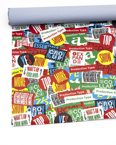

Was this Mercator?
Yes! At first, it was super boring but then I found all the definitions I had been looking for. The strict definition of marketing is “understanding the market,” with two possible options: either “you adapt” or you “shape it in your interest”. Another source of energy was my experience as a freelance independent graphic designer. The economic model for typography is rather different from graphic design because we are part of those rare designers, much like product designers, whose work can be reused. After ten years, I found myself with a ton of work that hadn’t yet been used but could be. I had kept in mind that royalties are supposed to allow designers to live off of their work even after their careers are over, with revenue no longer linked to production. The idea was to disconnect revenue from production capacity, this in order to allay my fears regarding the future. To worry a bit less about illness, about a lack of clients, and avoid rushing headlong into a continuous series of projects. I decided to work independently out of a blend of fear and curiosity.
How long on average does it take to develop a product?
I’d say two and a half years. That’s a conservative figure.
How do you choose the fonts that you develop?
Production Type was not my first experience with a foundry. My initial foundry was called BAT (Bureau des Affaires Typographiques, cofounded with Bruno Bernard, Patrick Paleta and Stéphane Buellet). It was our playpen in a way; we did lots of things we felt like doing but weren’t necessarily supposed to be doing. It was a formative, growing experience. We produced things that we liked. The problem with this type of self‑centred approach is that it’s all or nothing. It doesn’t deal with your true ambition, which is to leave your mark on the visual landscape while coping with demand. The BAT was a foundry that made statements. Production Type, too, though we are much more market savvy.
Do you still draw?
Absolutely. But very differently. I lay the foundations of a typeface though I no longer design it entirely. For me, though far removed from drawing, setting a creative course and relying on the talents of our in‑house team as well as outside designers to finalize the process is all about designing. So relatively speaking, our approach has something of the Renaissance workshop to it.
Sketches and designs aside, there are also encounters with outside designers and the discovery of new talents, isn’t that right?
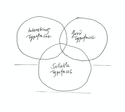
Yes. It’s difficult to carry on an abstract conversation with a designer on this subject. It’s always pragmatic, not abstract. But yes, it does happen. We consider fonts at the intersection of two territories: between those that are completely compatible with our catalogue, which means that we already have them, and those that are so different as to be completely out of place in our catalogue. What interests me is those in‑between fonts that are not only compatible but which also increase and enrich the flow of our design.
Is mapping a tool that you use?
I love the intersectional, I love what overlaps, when things stay on course and don’t deviate.
In 2010, what did you think you’d be doing in 2020?
In 2010 I was dividing my time between Paris and Montréal. I had left behind my Parisian workshop and lived in a small two‑room apartment with my desk up against a wall. I did a little graphic design; I was already doing a lot of typography, lots of logos and letterings, all more or less short‑term projects. I already had the BAT, but it never really took off. I was living from hand to mouth, and wasn’t intent on growing; I had no big plan, no strategy to speak of …
Production Type has now been in existence for six years. What were your thoughts when you launched it?
I didn’t wake up one morning thinking that this was what I wanted to do. I decided in 2012. BAT wasn’t going anywhere. The first step was to stop. I kept my shares but left the executive board. We all wanted different things, artistically speaking. I stepped aside.
You ended up buying back the BAT. Are any of their fonts now distributed through Production Type?
Yes.
Were you ahead of your time, or do you think it was a communication problem?
It was mostly a communication problem. As it turned out, I was able to put into PT all I couldn’t or didn’t do with BAT. Everything snapped into place when I came up with the name Production Type. It all assembled itself Matrix style, like when it all flows together for Neo. Production Type was created not for show, not out of vanity; it was not a hobby but a tool to distribute retail type for design professionals. The words “production type” sound serious and rather generic. So the branding needed to be serious and generic, and our type designs hyper efficient. That is the meaning of “production type.” Type designs that are practical, not type designs that tell you what to do. The wording, the design message were geared toward productivity. We had to be factual and say what we did and do what we said. After that epiphany it took a little time for it all to jell. Agreements and arrangements had to be made in order to gather resources. An expensive operation. I was often at the Superscript2 graphic design studio at the time, and I would go to and fro between Paris and Lyon several times a month. We managed to get organized and find work tools on the website with Martial Geoffre‑Rouland as it turned out. Everything happened progressively, though there were a few accelerators.
Where in 2015 did you think Production Type would be five years later?
Not where we are, that’s for sure! I had thought things would move more slowly. We are over‑performing in certain fields and under‑performing in others.


WNBA custom typeface, 2019.
Where are you under‑performing?
We are too much in the middle of midsized foundries. We remain independent, yes, but we are nowhere near the level of recognition we need to attain. People are not as aware of us as they should be. Those who know us are thrilled to use our typefaces. But they are not nearly numerous enough.
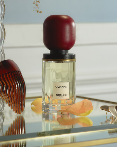

Custom typeface for Ormaie perfumes, 2018.
So your communication strategy is based on reputation building?
If you don’t create your own organic buzz, if you don’t go viral or if you’re not Swiss – that is to say if your reputation is not already made – it all comes down to investing in communication. However, if you don’t have the money to do that you have to build by focusing on your company’s core values, and the talented designers whose work you promote.

Where are you over‑performing?
Our licensing model: it makes money for designers and for the foundry. Everyone comes out ahead, the client pays a fair price. Our sales numbers were high from the outset, higher than what I had hoped. Subsequently, however, we did not keep performing at that level.
How about international sales? Was that a goal from the beginning?
It was. From the outset I communicated only in English. I thought that France would naturally and without us making much of an effort, be our primary market. Statistically speaking it’s 15 % of our sales revenue. However, this is a double‑edged sword. The French like to say: “No man is a prophet in his own land,” but it’s symptomatic of how typographic resources are managed in France.

Are clients less knowledgeable than in other countries?
It’s mainly that they don’t want to spend a cent. I think this is a shall we say cultural tendency. I make a distinction between countries with access to the Mediterranean and other European countries. Northern countries have a different relationship to the fluidity of currency, of money, and have far fewer problems spending more for the added value of professional design. Whereas in so called Mediterranean countries including France (and this is perhaps very Latin), there is a tendency toward economic irrationality.
Have foundries evolved these past 10 years?
Yes, somewhat. When the BAT began, we were a small business venture of which there were not many. We were France’s first incorporated type design and online selling company.
So is this basically an entrepreneurial issue involving artists/designers in France, and their approach to the production of type designs?
Not really, though in France we have a tendency to dwell on the glories of the past. Each century had its glories. France has traditionally excelled in the typographical field, except in the 1960s and 1970s, which we completely and utterly fucked up. French foundries took a beating then. And it wasn’t until the 1990s – when our profession began turning away from the industrial to embrace the digital – that French designers again began to make a name for themselves.
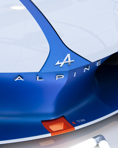

Custom typefaces for Alpine Automobiles, 2015.
Was this facilitated by the availability of production tools?
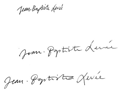
It was a worldwide phenomenon, though that doesn’t quite account for the hiatus we saw from the 1970s till 2000. It’s marketing again. I think market demands were at odds with what was then on offer. As I was saying, creating this company was extremely liberating. The first two or three years of Production Type, I had continuous epiphanies because the simple fact of hiding my name, my ego behind a brand set free a slew of things in me. Including a desire to make T‑shirts, stickers, and other Production Type products … Production Type is simpler to put on a T‑shirt than “Jean‑Baptiste Levée”. (laughs)
Would you have liked to know when starting out that creating a company would be such a liberating experience?
I would have liked to know that what I was being told was true, that is to say that our work was much more valuable than we thought. That’s what people kept telling us, yet our experience appeared to contradict that: clients negotiating rates, presentations without estimates, reverse auctions, etc. Everything we were seeing seemed to indicate that what we were doing wasn’t worth much at all.

To get back to the anxiety you were mentioning earlier – about having enough orders – your response was therefore entrepreneurial?
I headed in that direction mainly as an attempt to sustain us. As for royalties, we simply applied existing regulations, which also apply to graphic designers. Except that by agreeing to reverse auctions, graphic designers changed the power dynamic between customer and supplier. Now everything hinges on the transfer of rights: they do the job, get paid, and never see any royalties.
What would you correct in your development if you could?
I would develop a less ambitious but more efficient website. It seems very slow to me. I would have remained more focused. I have a tendency to go off in all directions, to try to make it all jell at once instead of moving from one project to the next.
You remain very productive. It would appear that you have high production rates, am I right?
I get that a lot. I might be a little paranoid, but hearing that makes it sound like we work in haste, and therefore – since typography is not a speedy business – that our products lack the finishing touch. It’s kind of an elitist vision of things that gets on my nerves. Other foundries are every bit as productive as we are, and yet you never hear that type of comment about them. On the other hand, many foundries are not only in the soft underbelly, they are dormant. There are also big companies that produce and capitalize on bestsellers.
Let us get back to your development: what did you have to learn?
I started by reading Les Échos. My two dailies are Libération and Les Échos. On the one hand a left‑leaning vision of society, and on the other – since I would never go so far as to read Le Figaro – a more analytical viewpoint. The things I had to learn had to do with entrepreneurial expertise: team management, human resources, investing. I also learned from my failures.
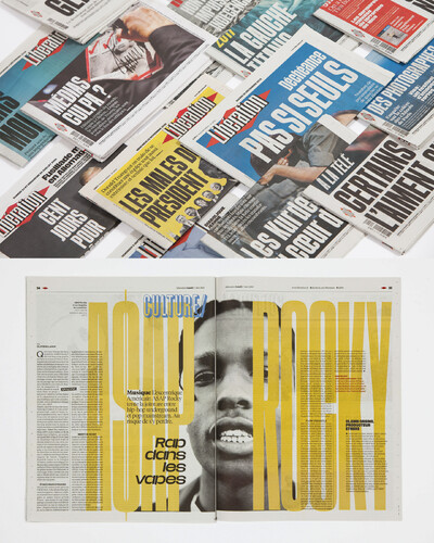

Libération newspaper, custom typefaces, 2015.
And of all the entrepreneurial tools you have acquired, what do you most appreciate?
In truth? The weekly review. I know this might not be a big fan favourite but up until now I think the team has appreciated communicating and having supplemental interaction on the work we’re doing. It’s crucial in terms of coordination.

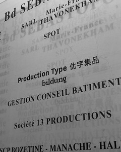
Production Type entrance hall, Paris
Have you begun to appreciate the management spirit?
Stapling together accounting statements is not my idea of fun. And since I don’t have loads of time, the mechanisms to do this rapidly are in place. Typography is a multitude of little chores that can be exhausting. Rather than avoid them I decided to take them on wholeheartedly. I feel like one of the reasons why our business has taken off is because I paid my dues in terms of straight entrepreneurship, with the onus being on me all the time. The thing I enjoy in this business is meeting people. Learning from them, sharing viewpoints, talking. That is perhaps why I could never myself be an employee, because after a while, unless you take a lot of meetings, your job ends up being repetitive.

You mentioned managing teams. How does one go about learning that?
As corny as it may seem, by reading Challenges and Management. Sometimes I think that I’m the only one (along with other “nitwits”) who reads them.
Do you also read books about management?
I buy books about management, but don’t necessarily read them. How to Be a Graphic Designer Without Losing Your Soul by Adrian Shaughnessy is one of the only ones I read all the way through, about 15 years ago. It was educational; not foundational but educational. I’m aware that I need to increase my emotional intelligence. I need to learn to better express my satisfaction and thankfulness to my teams, and stop recruiting solely based on skills. I need to hone my soft skills.
With the aim of injecting more intuition into the mix?
It depends on the project. We just did our annual progress review with our AD. I let him run things. He is so on the ball that I trust him completely. Sometimes I wonder why I feel like a control freak when I’m so fond of delegating. I always feel like the sum of the individual parts overrides the parts themselves. I should have been more aware of the need for recognition. Not all of my collaborators at Production Type are satisfied with their tenure here, and that troubles me. Twelve years ago I had a discussion with an old pro, someone who had been in the business forever, and he said: “In my career I’m most proud of the fact that I always maintained a good relationship with my employees”. I often think of that, and my inability to say the same rankles me. On the other hand, I have often over the years been critical of that utterance, because I feel it’s unrealistic.

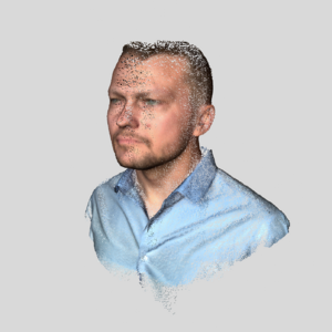
Jean-Baptiste Levée, CEO, Founder


Hugues Gentile, Senior Type Designer
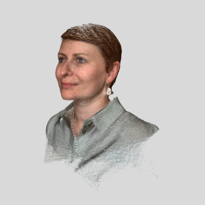

Jenny Richard Saint-Yves, Project Manager
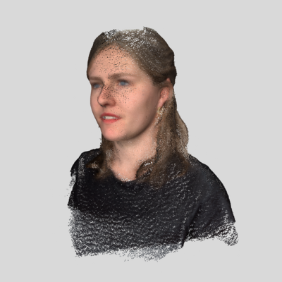
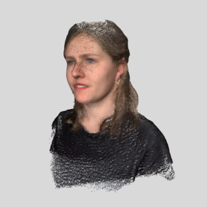
Marion Sendral, Type Designer


Edouard Spriet, Art Director
Speaking of which, how do you see time as it relates to your career?
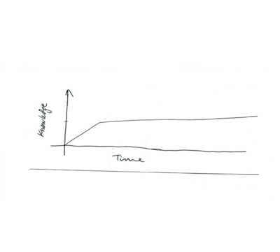
I have a family. Which means more responsibilities. I’m no longer working exclusively for yours truly. I also have a responsibility toward the team and its development, toward each member’s personal growth, their career. I don’t see myself stagnating in the 10 years to come. My metaphor is Super Mario 3: to get Mario to fly you have to press the A button repeatedly. It’s through action that you stay in the game. To stagnate is to perish.
What you’re saying is somewhat anxiety‑provoking, is it not?
Of course it is. These small, continual adjustments come from the start up world; like the fact of not thinking that once you have created a typeface it’s done and won’t ever be altered and you can move on to the next one. We are exploiting mechanisms that allow us to boost our brand’s reputation.
What do you mean by the start up world?
I’m talking about agility. You’re constantly tweaking things amidst a larger flux pointing in a single direction.
As far as development strategy goes, do your benchmarks reflect those of your competitors?
I try to learn from all approaches, all models. Out of curiosity, and self‑interest. There was a time when I would look at what start ups were doing, but I soon realized that our long‑term vision lay elsewhere.
You’re not going to be doing any fund‑raising?
Probably not. It might seem like a paradox since I sometimes feel like starting a partnership. I’m not going to, not because we don’t need it or because it doesn’t correspond to who we are, but quite simply because it exhausts me to even think about it. As long as I get paid and can be artistically proud of what we do, that’s good enough for me. I’m aware of our weaknesses. The business can’t for the moment survive without me. But that’s the goal: that the company learn to press the A button without me. If something should happen to me it’s important that my family but also the company continue onward, and transcend what I have done. The company does not bear my name, there are other designers in the catalogue. Their lives wouldn’t be over if the company folded, though they would certainly be affected by it.
You mentioned earlier that you wanted your typography to have an impact on the visual landscape. How do you choose the designs for your catalogue?
They have to be good, compelling, and marketable. Those three things at once.

Is it better for a catalogue to reflect a kind of homogeneity or is variety the aim?
My idea of variety might not necessarily be the same as other people’s. Whereas I might see our catalogue as quite varied, someone else might find in it an expression of homogeneity. Formally speaking, I think there’s a lot of variety in our current catalogue. Our homogeneity resides in the fact that our designs are all relevant, modern, and functional. There is nothing “historical” for example about our catalogue. What’s more, they’re not superficial or trendy “here today, gone tomorrow” designs, and our titling is made to last.
Are there any elements of the catalogue that you’re thinking of retiring?
It’s already happening.
Or elements that might make a comeback?
Maybe. I haven’t given it any thought.
And yet, people still go to Emigre, for example…
Designers who are 10 or 15 years older than us are much beholden to Emigre. Which is very good of course. In the 1990s it was huge. I do find depressing people’s inability to take a critical step back, contextualize and say that maybe just maybe using without a hint of irony Emigre fonts is, in 2021, somewhat passé.
Then how about for intertextuality’s sake, or referentially?
Even then. I hate to say it, but by 2020 standards the Emigre catalogue is not what it used to be. Conceptually it is of no interest. You can find a better Template Gothic, a better Mrs Eaves. They were pioneers; they were emblematic. On the other hand I refuse to let what’s happening to them today happen to Production Type. Let me be clear: people say this is digital, and typography files only weigh a few kilobytes nowadays, and the cost of stocking them is close to zero. This strategy is predicated on volume. Now if someone requests a font that has been dereferenced, we bring it back out and license it, but just because stocking fonts costs nothing doesn’t mean we’re going to keep them, since it’s not good for our image to keep them in our product line.
Who is currently buying your typefaces?
Studios and agencies. Independents. In the United States, Canada, mainly English‑speaking nations; also Germany and the Netherlands.
You were saying that French awareness of typography continues to lag behind other countries. Don’t you have more orders overall?
Our heightened profile has led to an increase in typeface orders, but has not appeared to have an effect on licensing. It’s a supply rationale. Every year for the past 15 years a good three dozen type designers have appeared on the scene fresh out of a training course in “type design.” Whereas before they had studied “graphic design and typography”. So you do see more typography in portfolios, on websites, in pitches. You see more typographical work overall, mostly in the media. I think this is a cyclical phenomenon. In fact the current wave might already be behind us. At one point there was a lot of motion graphics; now we see more 3D, in the craft sense of the term. Typography is alive and kicking thanks to the increasing number of type design students.
How is this new generation of type designers different?
You see a lot more hedonism nowadays. They’re capable of doing the wildest things. Then they hold their heads up high and say that what they’re doing is good typography. I like that approach. And yet I learned typography the old‑fashioned way, that is to say I was taught that typography was “a system of rules that must be respected.” That is why people say we’re a pain in the ass. It’s true in part; lots of colleagues my age are a pain in the ass. According to a friend of mine, the reason we have such a bad reputation is because we’re pernickety. What the young designers are doing today isn’t just a trend. They are much freer in their approach to the business than we ever were.
How do you build a relationship with the type designers Production Type collaborates with?
Some I reach out to; others reach out to me. There has to be a triple understanding: artistic, financial, and friendly. By mutually enriching each other we enrich the foundry catalogue.
With your experience, when you see these young type designers, do you ever have an intuition about who amongst them might one day run a foundry?
Intuition? I get these things wrong most of the time. I often wonder which up and coming type designer I’m not that impressed by is actually going to make it. Lots of folks I found extremely talented never really made it or simply moved on, having to find a job very quickly and being unable – somewhat in the vein of the industrial designers – to take the time a product needs to mature, the time it takes to get a typeface right. Overall, there are more trained type designers than professional type designers.
You mentioned the soft underbelly of foundries, where in your opinion your own company finds itself. Why in your opinion will some of those foundries grow?
Critical distance, introspection, and a talent for self‑criticism – these things are essential. You have to have the courage, too, to dereference certain fonts, and a touch of modesty as regards your ability in terms of graphic design and communication.
Is that why you hired an AD?
Yes. It’s the architect syndrome. In type design you have lots of people who overestimate their graphic design skills.
What is the architect syndrome?
Architects always think they’re building pyramids, regardless of what they actually are building, and since they’re building pyramids they think they can also create a scenography, a product, etc.
Do you think there is a likelihood of mergers and/or acquisitions? For example, a foundry that might take it upon itself to raise money with the aim of buying you out?
There was a foundry that raised money, and it failed: FontYou.
What was the problem?
It’s normal when you’re a start up, but I think it was the cost of digital development. And a product problem. To get back to your question, I think we’re immune to these kinds of phenomena; the sector isn’t lucrative enough. The market has a certain mass, but not enough to generate such a hive of entrepreneurs. There are other sectors that are also quite difficult to access and practically identical in fact, such as digital or 3D product design, and yet they are much more lucrative. In terms of absolute return I could say: “Yes this is possible”. After all, I bought back the BAT; I’m therefore always open to that kind of idea. There were merger scenarios, so it is possible. And yet, overall, our relative return means that we don’t interest many investors outside of our milieu. The market is neither ready nor big enough to make us attractive.
You might still be interested. Have you been approached by anyone?
Yes, but the market is too small.
How much sales revenue do you need to be attractive to an investor?
Around 10 million euros, I think.
What strategies do you see becoming essential in the future?
PR, web development, analytics. We already have all the tools in place, we have the data, we just need to increase processing capacity. But everything has been thought out. Six years ago when I got my ducks in a row I hoped to one day have the resources to use them. That day has not yet come.
Are you sure it would make a difference?
In terms of PR, yes. And a data analyst could help us better grasp purchasing behaviour. A PR person would improve our outreach, improve brand recognition.
I suppose you mean recognition elsewhere than in the trade press that is already quite familiar with you? Do you buy magazine ads?
Yes. Part of my communication strategy is to remain present in the minds of the decision‑makers. When a client sees a list of three, five, ten typographies, it’s imperative for us to be on that list. To reach this goal, first we need a catalogue that makes us relevant as well as present in the mind of the buyer. This goal can be met rather easily. The second one is harder. It’s a daily effort to put your reputation out there, and build and increase brand awareness.
If you don’t invest in PR or analytics, how do you manage to meet your objectives in terms of visibility?
I go the business development route, meeting people, prospecting, going to trade shows. Shmoozing. Preaching the good word.
How do you find the best way to prospect? Do you have any strategic references?
It’s rather organic. Grow and expand your network. If purchasing databases was all you needed, then everyone would be successful. Essentially it all boils down to being a nice, fun, and interesting guy to meet, someone who not only doesn’t waste your time but actually brings something to the table. You’ve got to have humanity, that quality that makes meeting you a pleasant experience. This of course has nothing to do with the quality of your product; Yorgo Tloupas (AD and founder of Yorgo&co) expressed it quite well, saying you must always imagine you’re competing with someone who’s not as good as you, but who expresses himself better. Though terrifying, this idea is motivating; it makes you try harder instead of simply relying on the quality of your work.
Hence the importance of developing soft skills. How does one go about that?
I don’t need to read 50 articles on how to give an interesting lecture. As long as you don’t read what’s printed on your slides, as long as you’re mobile and able to convey both form and content, then you don’t need to write a thesis on the subject. Though I don’t have too much time at the moment, it turns out that there are training programs, including very interesting ones, for CEOs. I also read business newsletters, though the offer is relatively weak. As you were saying, there isn’t a book on how to prospect creative businesses.
You were talking about presenting your work. Have you ever had to pitch a project?
Very seldom. We avoid competing. It’s not too prevalent in typography, at least not in France. I find it too stressful, too terrifying, too nerve‑racking. I’m uncomfortable in those situations. Presenting your work to the public is already risky enough. I don’t think that competition stimulates me.
How has your profession evolved?
I think we’ve reached the end of a cycle. I get the impression that something new is brewing.
It was easy to start an e business and produce typography rather quickly. The reason why I think we have reached the end of a cycle is because I have yet to see anything new on the horizon. Something is going to happen; it just hasn’t happened yet.

And how is the market dealing with this end of cycle?
There is a double phenomenon of growth and concentration. France is an exception: internationally, typography sourcing has outdistanced the big distributors and shows no sign of slowing down. For me an AD must nowadays be able to cite from memory five or six independent foundries. And far from being unique or different, this ability should be taken for granted.
Because this isn’t the case in France?
I’m talking about ad agency ADs. The economic fabric of French design is the no man’s land between independents who work for theatres and the agencies who work for supermarkets. In between those two you have small companies …
Independents can also work for brands …
Twenty years ago graphic design was still a job where your parents had to really trust you or else they didn’t care because they had enough money to let you do what you wanted. This is effectively no longer the case. In art school the most heavily recruited internships are in graphic design. Art school turns parents off because they can already see their kid smoking hand‑rolled cigarettes and having to survive with odd‑jobs because they can’t make it with their art … Whereas in graphic design parents can now visualize a job with a career and a good salary.
Things have also changed in terms of royalties. Many foundries are currently reviewing their model. How about you?
Yes. There is a real but slow‑moving evolution in terms of our clients’ typographical knowledge. This must not be ignored. We need to start marketing the offer. Historically, our clients have never been able to grasp the “software” aspect of what we were doing, I mean the existence of a file that we license and then download onto a computer. What they do know how to do is how to buy creative assets and materials: photos, illustrations, sound or video using criteria such as length of time and operational area for example. The purchasing department people can never understand why they can’t acquire this creative asset the same way they acquire other creative assets. The idea is to shift our offer, to return to the sort of geographical and temporal criteria our clients can grasp. Beyond the deal itself, we want to have criteria for calculating that the client can share easily and that we can easily verify. Such as the number of employees, or more universally speaking, time and space. We have been hearing for 15 or 20 years that we need to educate the client. People are always saying that they don’t understand what we do, how we do it, how we sell it, how typography is sold … Rather than complain about the big agencies and brands that buy our licenses for a single user, I prefer to change the rules and ensure that the big groups fork over what is fair without harming the independents and the studios that always do cutting‑edge work.

You don’t fear foundries using many different models? Mightn’t this make the competition for royalties even more cutthroat?
That is how the purchasing department thinks. Not the designers and decision‑makers. On the one hand, no matter how sophisticated what you offer them, they will still want the font that such and such a foundry brought out six months ago, and no other. On the other hand, since this is an open non‑regulated market, discrepancies in terms of offer should come as no surprise. There will always be somebody with cheaper prices than you. Though this doesn’t help, I’d rather our market remain too small for regulation to be necessary. People don’t understand that licensing contracts are not standardized. This is not possible because each foundry is focused on its own clientele, its strong suits and weak artistic points, but also development opportunities. We adjust our contracts in regard to our clients who are faced with difficult choices.
We see a lot of foundries using new approaches such as branding and customization. Is that something that you hope to develop?
It’s funny because 10 or 15 years ago it was the opposite, that is to say that studios and agencies set up their own foundries. This model didn’t work too well. It will always be something you sink your money into without any returns because you don’t really need it for your business to prosper, and so it fails. The “Man proposes, God disposes” philosophy is doomed to failure. This is a luxury we don’t have. What you seem to be describing – a foundry that creates a branding studio – has only ever been done by Commercial Type when they set up Commercial Studio. It was a serious venture, with an outside AD and everything. And it closed in January 2021.
Might you team up or create temporary partnerships with graphic design studios for example?
We’re already doing it. This is what works best, when each person is an expert in his own field. It creates an intersection focused on one subject. Another example is logos. Not only do we not do many of them, but we’re doing fewer and fewer because people think we don’t want to, or that we’re too big for that. Whereas this type of thing would allow us to remain autonomous. On the other hand, in the case of branding, we would need a partnership: it’s even better when an artistic collaboration leads to the creation of a logo. Our biggest selling fonts are often those that came out of a discussion with an AD who pushed and challenged us.
If you could do your job at another historical period in time, when would it be?
None comes to mind. It’s never been as easy to do what I do. I’m not nostalgic about a golden age of typography. When I think of how typefaces were designed in the past – and I’m not talking about the result, which is magnificent and admirable – it was nothing but suffering. If forced to choose, I’d be a Mad Man from the 1960s. An agency draftsman, one of the last in-house type designers. Making logos, letterings constantly, all day. Making 50 drafts of the same thing.
Is there a book that helped you to better grasp your profession?
Sapiens.
Is there an artist who influenced your work methodology?
Olafur Eliasson. And Caravaggio, who was something of a businessman himself.
Any advice for those starting out on an independent career?
When you’re starting out, always assume the client is giving you a vote of confidence. But this can only happen if you exude self-confidence.
Does the same go for those who would like to start their own foundry?
No, I would be more radical there. You’ve got to go whole hog. It’s all or nothing. You’ve got to give yourself entirely over to the project, be as demanding with it as you are in your approach to typography – what I mean is perfection or nothing, no middle ground. You’ve got to have that goal. I don’t mean to be too peremptory by saying: “Give me excellence or give me death”, but you must in any case aim for excellence and enjoy the process of attempting to attain it. Because otherwise you’re either a dilettante or an amateur.
